Times Series
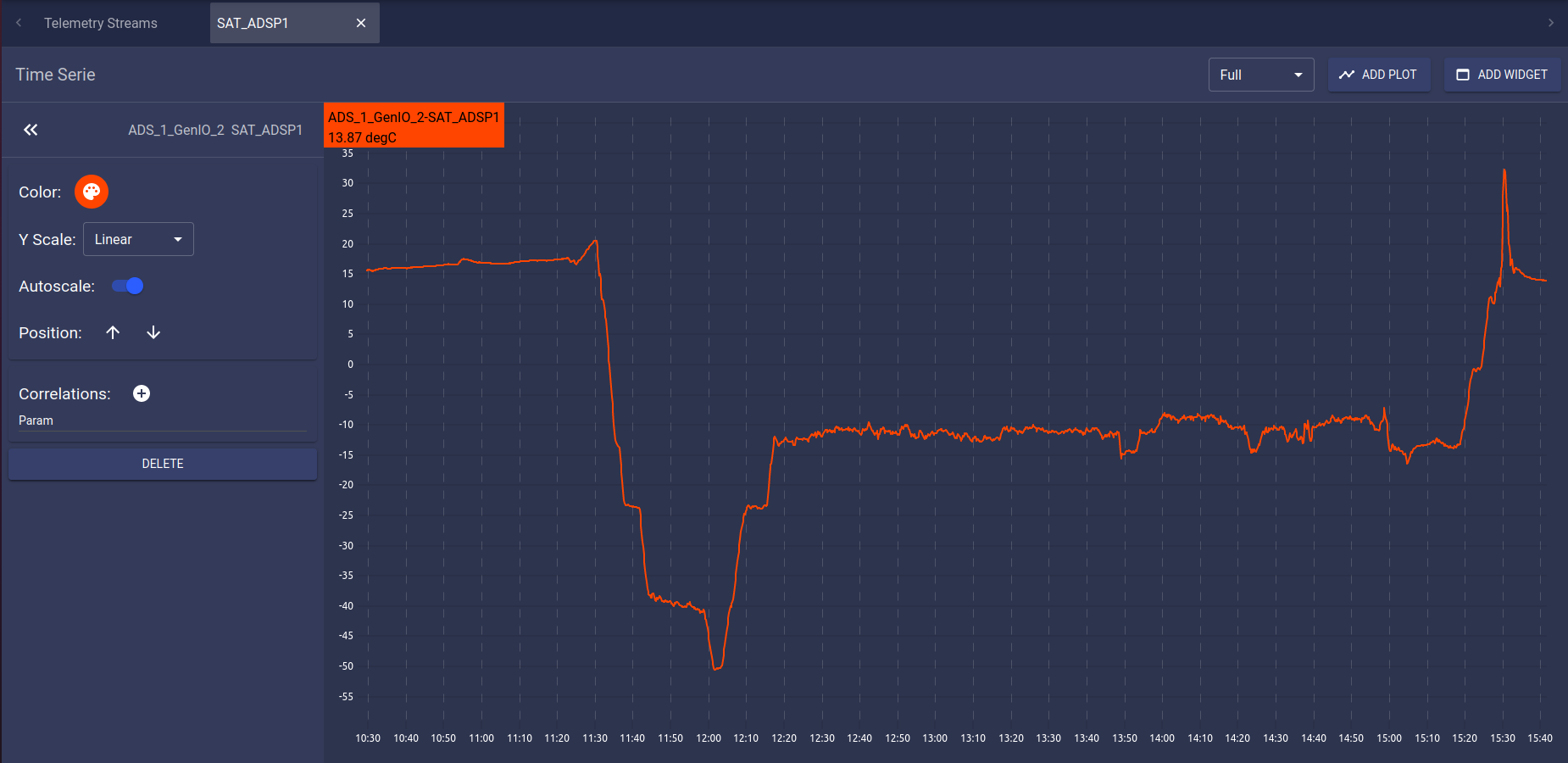
Graphical time series for each parameter can be added in a new tab.
Clicking on a parameter in the main streams tab will open a new tab with the corresponding time series plot.

Telemetry time series tab
For each time series tab, several controls are available in the tab topbar.

Tab topbar
The  dropdown menu allows to select the timespan
for the time serie, from Full to 1 minute.
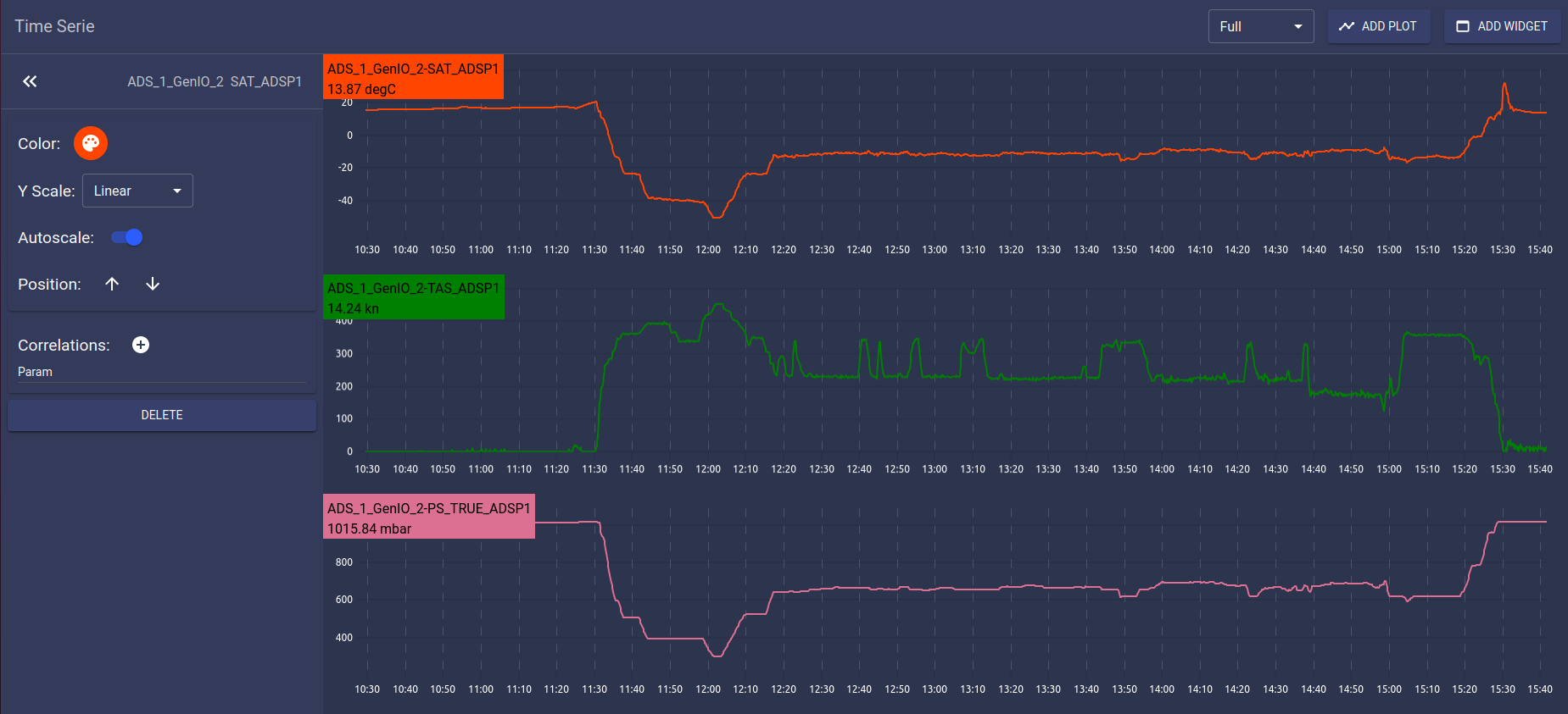
The  button allows to add another time series under the existing one.

Multiple plots in the same telemetry tab
A single tab can display any number of plots, though all plots will fit in the screen size. Adding too many plots on a single tab can thus result in unintelligible display.
The  button allows to add a widget containing the current
telemetry tab on the map. See Widgets section.
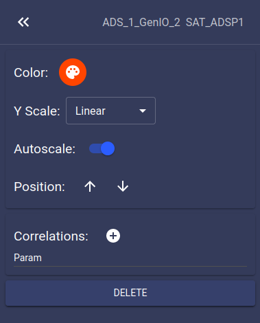
The side menu allows to edit the selected plot content.

Side menu
For each plot in the current tab, the following controls are available from the side menu:
allows to change the color of the primary parameter on the plot
allows to change the scale of the Y axis (either linear or logarithmic)
if enabled, allows the plot to automatically adjust it’s Y-axis to the displayed values. Disabling it will display a ‘Min’ and ‘Max’ text field in which the user must define the extremes of the Y-axis then click on th ‘APPLY’ button.
allows to move the plot relatively to the other plots in the current the tab
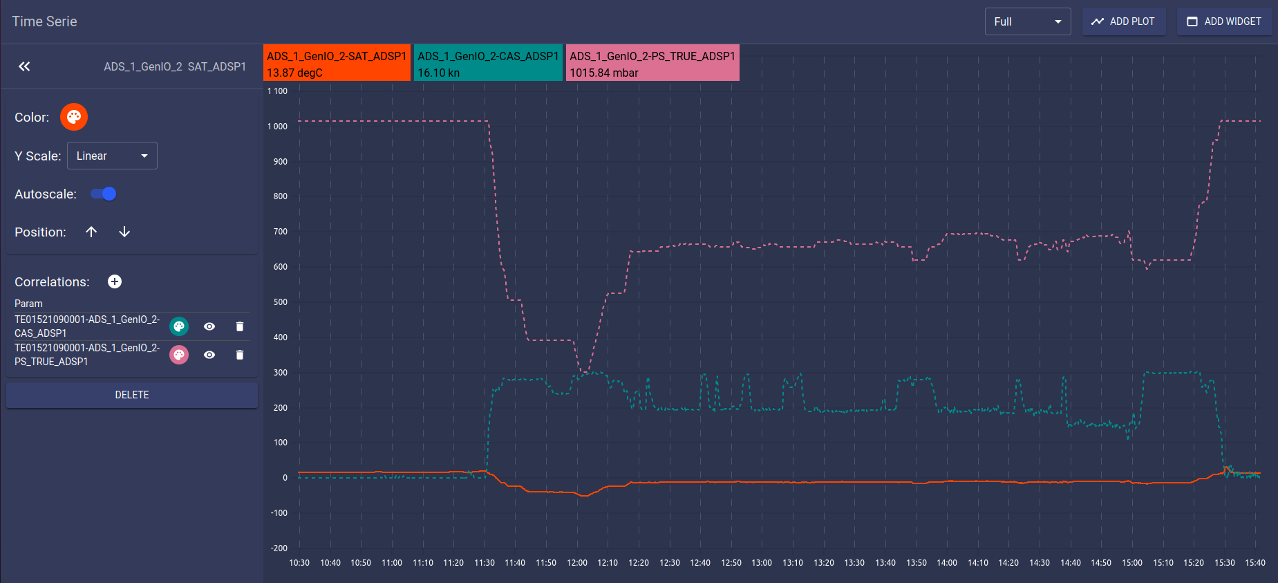
correlations section allows to add and manage correlations, which are other parameters displayed on the same plot.
allows to delete the current plot. If this is the last plot in the tab, it will close the tab.

Plot with correlations
To select another plot in the same tab, click on the paramater name in the chart area.

Param name